Outcome
Smart Widgets was the first smart feature in Venngage designed in response to users struggling to create and edit visualizations with repeated elements. It was designed to help users edit while maintaining the design complexity and clean structure of our templates.
I worked on the initial release and MVP scope which provided the foundations for our smart platform.
Since the release of this feature in Sept 2019, we have continued to work towards our smart platform vision. We have released a variety of different smart widgets such as charts, diagrams, mindmaps and flowchart, as well as increasing the number of smart templates we offer.
Case Study
Context
Venngage is a simple design platform that targets professionals without a design background to create stunning visuals to aid their communications. The tool offers over 8,000 customizable templates with a simple WYSIWYG drag and drop editor.
Our core customers are busy professionals (execs, marketers, hr) that want to easily visualize complex processes, workflows and training materials in an engaging way. Majority have no prior design experience, and our mission is to help our users visualize their information.
The Problem
The editing experience in Venngage has always been very manual, which can make become quite tedious if you have more information than what is presented in the templates.
The process of modifying templates with repeated elements (such as lists, timelines etc) was one of the pain points that was mentioned consistently through user calls.
“How do you make the timeline longer”
“I need 6 sections, this template has 5, can I duplicate one more section or do I need to find a template that has 6?”
This manual editing process is shown below :
- If a user has more text than the template contains, they have to manually resize, reposition and re-align widgets.
- Adding, reordering or deleting sections from a template is a multi-step tedious process.
- In the end the finished designs often don't look as polished and professional as the starting template.
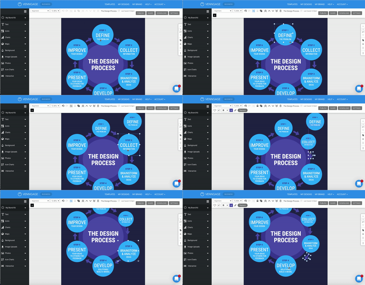
Demonstrating the editing process required to add one more step in this cyclic list.
Research & Discovery
How are others solving this problem?
Some of the tools I looked at included beautiful.ai, Powerpoint’s SmartArt, and miro (Realtime board at the time).
- Most of these tools had the ability to add and delete sections with the design shifting to accommodate the change.
- Some tools had interchangeability options — the ability to switch from one variation to another (ie. vertical list to a hub and spoke or cyclic list).
What I noticed across all of these tools was the minimal complexity of the designs.
.png)
Other tools : powerpoint | beautiful.ai | miro
Google Sprint Session
The goal of Venngage’s modified Google Sprint is to generate and de-risk innovative solutions to a well-defined user problem.
I ran the brainstorming session for members of the product team, a few senior engineers and stakeholders.
The goal of this specific sprint was to focus on the manual editing process of templates.
- How can we create a smarter tool?
- How can we make the editing process easier, more intuitive and enjoyable?
- How will this change the way our customers interact with the editor?
- How do we allow users to easily add, delete and customize sections in our templates?
The sprint allowed us to narrow down the problem and helped me further define the design vision and project goals.
Sprint : Crazy 8’s /dot voting + research & sketches
Vision
We started calling what we wanted to create, a smart widget — and we needed these smart widgets to keep the integrity and complexity of our current templates.
The larger vision was working towards building a smart platform :
"Smart Platform is an editing experience that's simple, intuitive and quick. It's founded in responsive widgets that make up key template elements: timelines, diagrams, charts.
They are easy to edit, they adapt to users' content, they can be automatically branded with users' brand guidelines and reused in various styles and structures across a suite of templates.
Eventually, everything from a single text box to the whole page will adapt to users content and respond to the document format."
.png)
Solution
The goal of this project was to build the foundation for smart widgets.
For the MVP scope we decided to tackle list infographics specifically, as this is one of the highest created categories by our users.
.png)
List Infographic category
Anatomy of a Smart List
A smart list is made up of a number of nodes (repeated element in the list).
Each node is made up of a number of cells (image, icons, text).
Nodes can be added, deleted and reordered.
.png)
Behaviours :
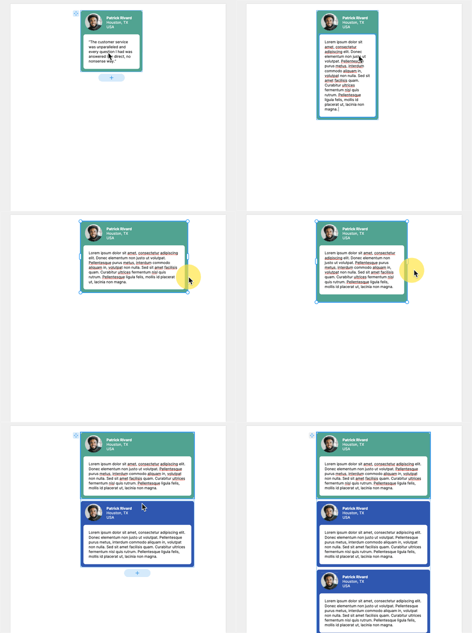
- Adding a node by clicking on the + button (underneath the SW in a vertical list or on the right in a horizontal list).
- Deleting a node by selecting it and clicking the delete key or by using the delete icon in the toolbar (same behaviour as legacy widgets).
- Reordering a node within the SW by clicking and dragging the node to a different position within the SW.
- Reordering the SW by grabbing the 'move' handle (top left of widget).
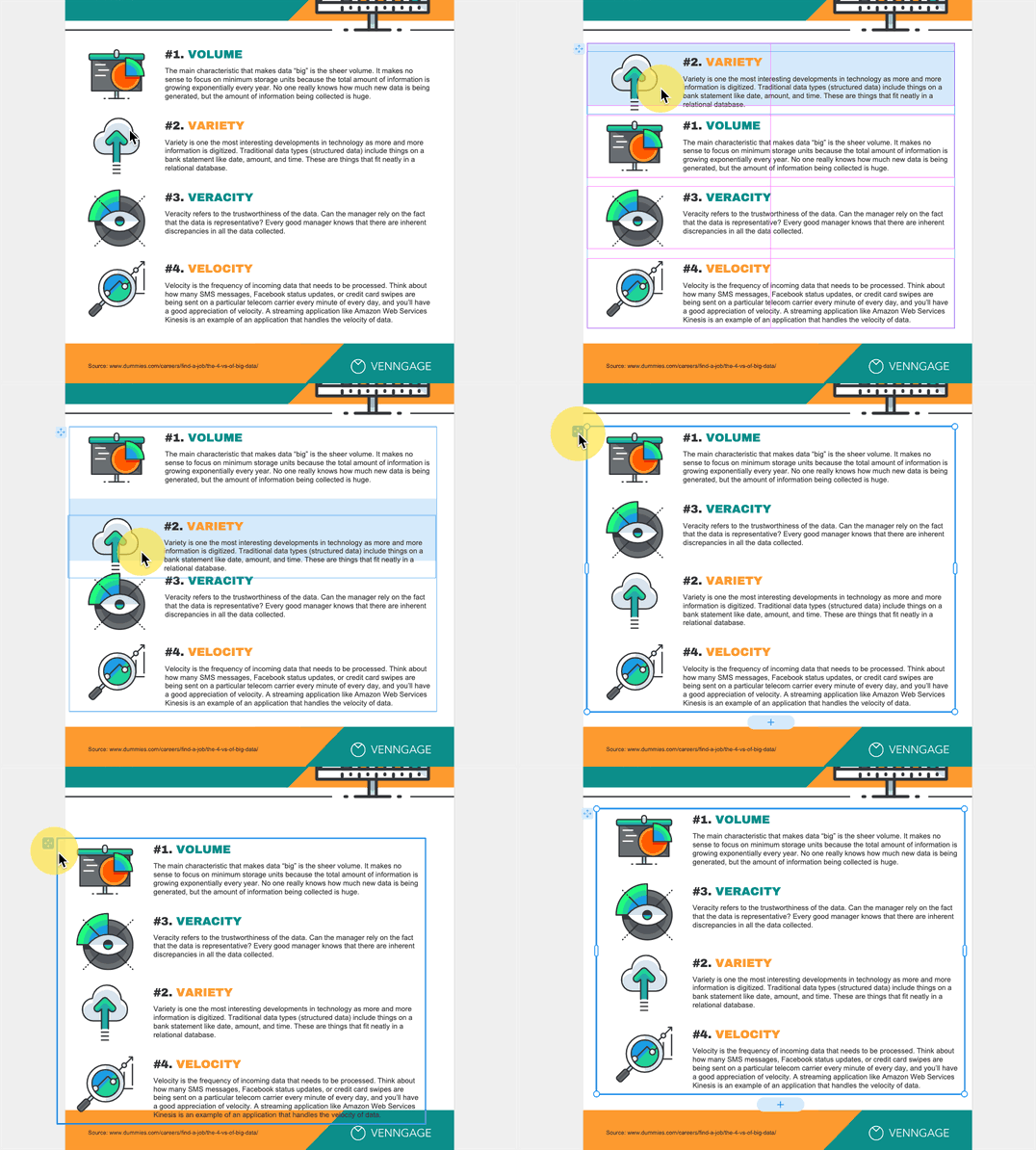
Template Creation Process
Another important flow that we had to consider was how the template creation & publishing process would change.
Currently our in-house graphic designers create designs in the admin editor and publish those as templates to be used by our customers.
As one of our project goals was to keep the integrity and complexity of our templates, we needed a way for our GD team to create beautiful and complex smart widgets to include in templates.
- In the admin editor, you can open up a new Node editor
- This simplified editor would open up in a new tab, where you could design the node.
- The size of the canvas would determine the size and shape of the node (the repeated element in the SW) .
- Once the node has been designed, back in the main editor it can be inserter onto the template.
- The designed node is now within a smart ‘grid list’ widget allowing the designer to duplicate it and change the content of subsequent nodes.
.png)

The inserted node is now inside a smart grid list widget - they could now add more nodes and update the contents (text / images / icons) before publishing the new template.
The Outcome
We initially released 10 smart templates.
These templates all had equivalent free form templates. We wanted to compare creation / completion rates between the two experiences.


Product tour
Usability Testing
Quantitative Metrics
Smart template completion :
- 41.4% in core paid users vs 44.7%
- 8.8% in core all plans vs 7.9%
- 12.1% in all users vs 11.5%
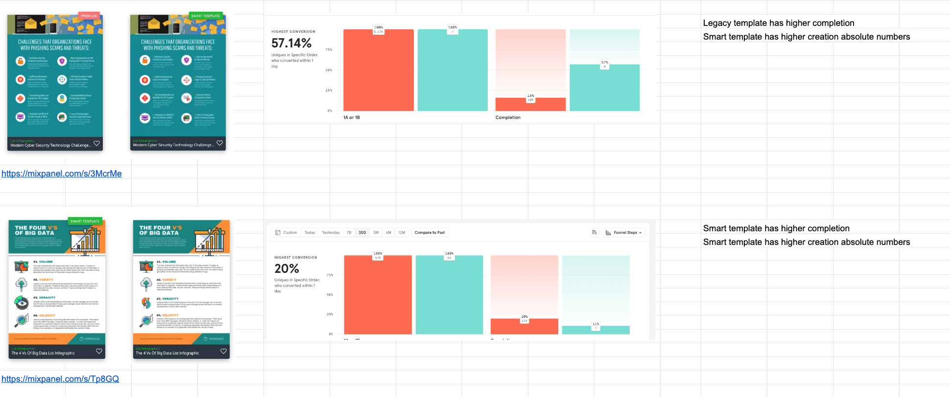
Editing experience comparison between smart vs free form.
Qualitative Metrics
Observing user created designs :
- Users largely followed the structure of the template and the style of the node.
- Users were able to create & complete templates using smart widgets.
- Users compensate for missing functionality by combining smart widgets with legacy widgets.
Better image experience, ability to resize/scale and ability to delete cells will go a long way to improve its usability.
Next Steps
The UX of Smart Widgets is different to other Venngage widgets, since it limits the users’ freedom to maintain a rigid structure. The first version provides the foundations for this feature, but has a number of areas of improvements.
The key issues that should be addressed are related to usability of the key SW functions and lack of awareness of the feature.
- Education before the editor - Users may not know what ‘smart templates’ are and how to find them. Since we only have a handful of templates and no information on the templates page, other than the label, it’s fair to assume that users often come across these by accident and/or require further information.

- Education in the editor - Users that have experienced ‘normal’ Venngage templates are not used to the restrictions and don’t understand how to use it. Most users that create a Smart Template, will have started off with a ‘normal’ template. This is likely to have a negative effect on their first time experience of using SW, resulting in abandonment.
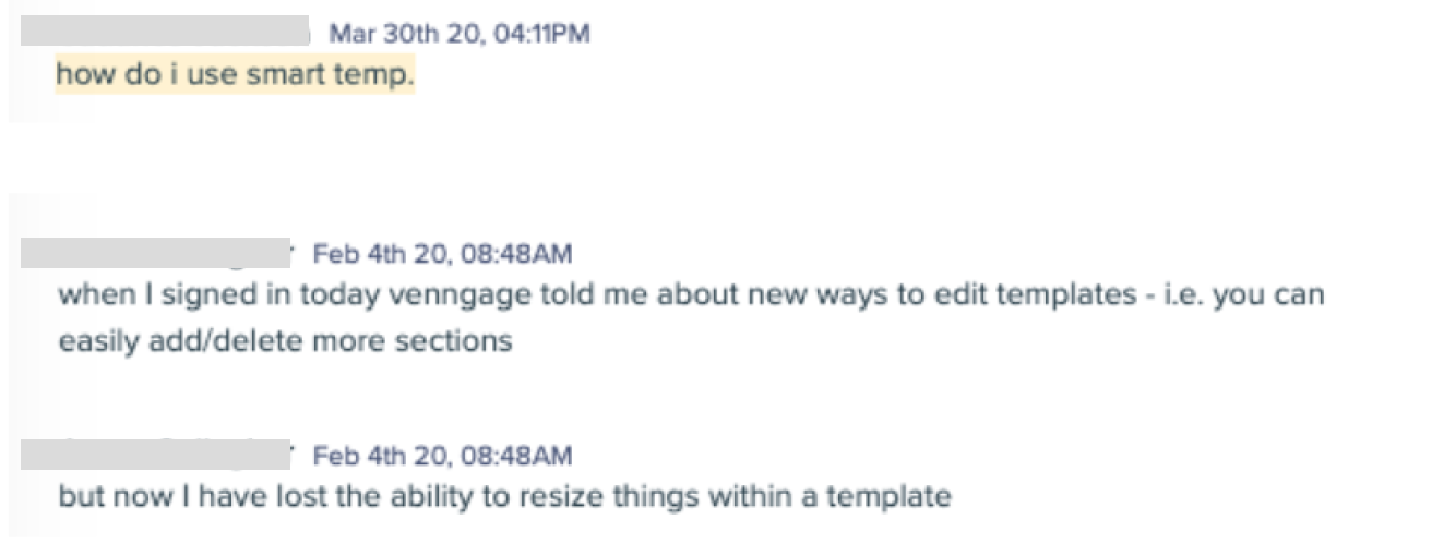
- Usability of Smart Widgets
- Adding + Deleting nodes - If the user reaches the maximum number of nodes that fit within the bounding box, they need to extend the bounding box to be able to add more, however there is very little user feedback.
- Reordering of nodes within a smart widget - Reordering is not intuitive. Since a large proportion of the node is taken up by a text box (which is not draggable in SW), it’s hard to find the area where to drag the node, or to even know that it’s possible. While dragging the node, it’s not clear where the node will go and how your layout will be changed.
.png)
List of improvements and bugs to be prioritized for V2.
2022 Updates
Since the MVP release of smart widgets, others in the product team have worked on making improvements to its usability and working towards our Smart Platform vision.
- Addressed the usability issues mentioned above, including node responsiveness :
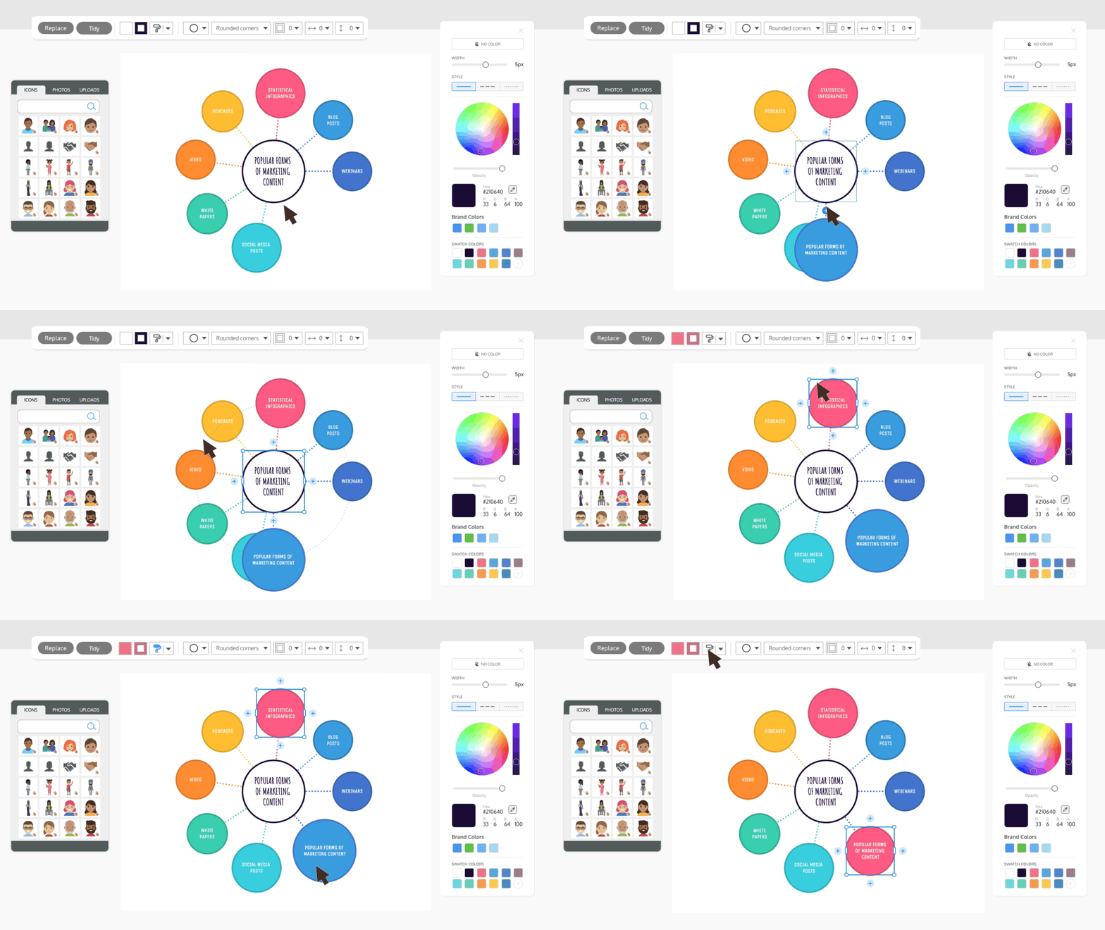
- New smart feature - mind maps.
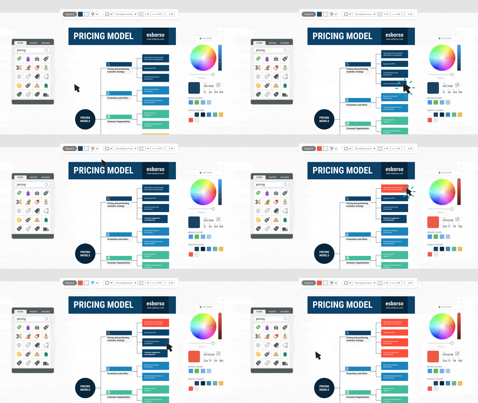
- Released ~300 smart templates.
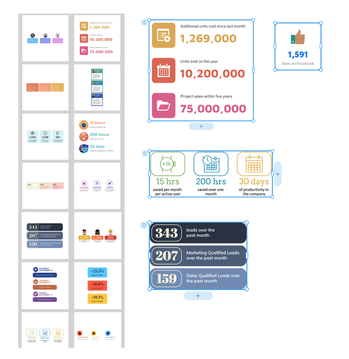
- Added basic smart lists and smart nodes in the editor left panel, which can be added to any template.
.gif)
.png)

.png)


.png)
.png)
.png)

.png)

.png)


.png)


.png)
.png)
.png)
.png)


